IEMR content modules

This is the intro to the page – it works as a simple introduction and might contain details on what you might expect to find. Optimal length in the header section is about 150–200 characters.

This is the introduction text and should only be used once per article / section. It works as a simple introduction and might contain details on what you might expect to find. This can be slightly longer as it's not affecting any other elements, ideal length would be about 150–290 characters. It's not necessary to have one in this first section if you already have an introduction in the header.

For consistency throughout the website it is recommended that the first module on the pages with the Default Template is “Text module” set to left alignment. This module sits close to the title and introduction text, and the visitor will naturally follow this flow.

If you have a header image

Best practice would be to use this module with left alignment. You can have intro text selected, however the alignment needs to be set to “Text left” in order to prevent the header image from interfering with the text.

“Text right – intro left” and the different quote-layouts are best used without a header image, or further down on the page.

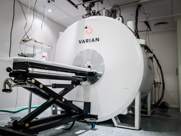
Cine cardiac imaging is the primary technique by which cardiovascular magnetic resonance (CMR) imaging characterizes regional and global contractile function of the heart and resulting blood flow through the great vessels. It has evolved to be the gold standard in both clinical and preclinical cases to assess heart structure and function.

The standard method to acquire Cine is slice by slice in short axis view, but it is time consuming. Our lab has developed fast imaging technique, which speeds up to 8 x. (McGinley et al., 2019)

This is a centered text module, best used further down on the page and not as the first module below the header.

Add images and headers to create pauses and breathing room in longer texts. You can even add them to this text block if needed.

This module works really well on longer texts, however best practice would be to have at least 800 characters for the block to be properly balanced. This text block contains 957.
Heading 2

This module should be used when you want to highlight something e.g. a few special features in your core facilities, a list of links or as an intro to another page.

Use it with care – too many modules of this type on the same page will require a lot of space and should primarily be used as a pause on longer pages.

Heading level 2

Try to reduce the use of these modules within the same section. If you choose to use this module on a page, as a general rule use at least 2 and maximum 5 on the same page. Alternating the layout (left and right images), will make the layout more interesting.

Ideal text length in this module depends on the image used. The text will center align vertically on the image, as a result a vertical image will give room for more text. Aim for about 300–600 characters in this module.

Optional

First column

The two column layout was specifically made for the core facilities sections that would link to child pages. This module works better when used repetitively to create a rhythm on the page and it is more balanced and symmetric than the module with text and image.

This module works very well for short introductions to linked pages or with a link list in the bottom.

Link 1

Link 2

Link 3

Optional pre-heading

The second column

Even though the column layout isn’t meant for long reading, it handles more text than the “text and image”-module does. Narrow text columns reduces the readability slightly, all though it is a nice way to present more content in a limited amount of space. To increase the readability in a narrow column use shorter paragraphs and separate the content into sections with headings and images.

The module is flexible and can be used for text as well as images. For instance you could use it with image(s) in one column and text in the other, a combination of both and even images only. The columns will align in top as long as there aren’t any hidden characters or spaces. You can inspect the HTML-content using the “Text” pane for the editor in the backend.

This specific column has 967 characters. Ideal text length is 450–1200 characters without headings or images – if the content has either image or sub-headings the text can be slightly longer.

Images + text

This works well depending on the images. Preferably these would be horizontal in a layout like this, as the text beneath would be pushed down if they are too tall.

Heading 2

To add a caption-styling to the text beneath the image, you’ll have to add a class to the paragraph, in the “Text”-pane of this module in the backend.

<p class=”caption”>The content</p> will result in a caption style

Image caption

The second column

Even though the column layout isn’t meant for long reading, it handles more text than the “text and image”-module does. Narrow text columns reduces the readability slightly, all though it is a nice way to present more content in a limited amount of space. To increase the readability in a narrow column use shorter paragraphs and separate the content into sections with headings and images.

The module is flexible and can be used for text as well as images. For instance you could use it with image(s) in one column and text in the other, a combination of both and even images only. The columns will align in top as long as there aren’t any hidden characters or spaces. You can inspect the HTML-content using the “Text” pane for the editor in the backend.

This specific column has 967 characters. Ideal text length is 450–1200 characters without headings or images – if the content has either image or sub-headings the text can be slightly longer.

First column

A content container could be used to make a new section on the page. Don’t overuse the option to choose a different color, as a constant change of background color might alter the visitor’s focus. Try to have as few sections with background color as possible.

Even though the column layout isn’t meant for long reading, it handles more text than the “text and image”-module does. Narrow text columns reduces the readability slightly, all though it is a nice way to present more content in a limited amount of space. To increase the readability in a narrow column use shorter paragraphs and separate the content into sections with headings and images.

The second column

The module is flexible and can be used for text as well as images. For instance you could use it with image(s) in one column and text in the other, a combination of both and even images only. The columns will align in top as long as there aren’t any hidden characters or spaces. You can inspect the HTML-content using the “Text” pane for the editor in the backend.